Monday, 3 May 2010

Branding from CR


My brief for OUGD203 is not necessarily developing a brand image, but the identity of the corporation follows the same principles for success.

- Authenticity
- Affinity
- Personality
- Respect

It has a few examples of brand image done well. Not however 'cool' brands, but brands that work and have flare.

Sunday, 2 May 2010

Colour, Place, shape


Publish Post

Monograph - Advertising Trust


This months monograph is a feature on old wall advertising. The 1900s billboards.

It is especially interesting to see examples of brands such as Hovis and Guinness. It shows the exact context, formal, scale and location of historical design and therefore allows designers to draw a comparison.


Perhaps, in reflection from these examples, I could consider my typography prints as appropriated pieces of advertising. Their context and audience affecting their choice as type.

However this seems too much to be an exhibition about advertising, and not typography. A mid-point could be typefaces that have synonymous links to specific demographics.
Something to think about...

Monograph - Posters

Monograph

This months monograph was a great 'short' on poster design in todays design climate.

It has some implications to the world of and need for posters. Not just for clients but also for artistic expression.


These prints are inspirational. The use of type and artistic expression is borderline fine art. This is the approach and passion I should go about my own typography prints for my brief. They need to be passionate, technical but also accessible.

Type Ideas & Inspiration


There are so many opportunities to be creative with the second part of this brief. I think the set of designs should have a consistency throughout. Not a rigid guideline that must be stuck to, but certainly a common element.

In this circumstance I could see the possibility of having a grid to work to or at least some boarders. It will also add the idea of the type being framed, and therefore become the central theme.


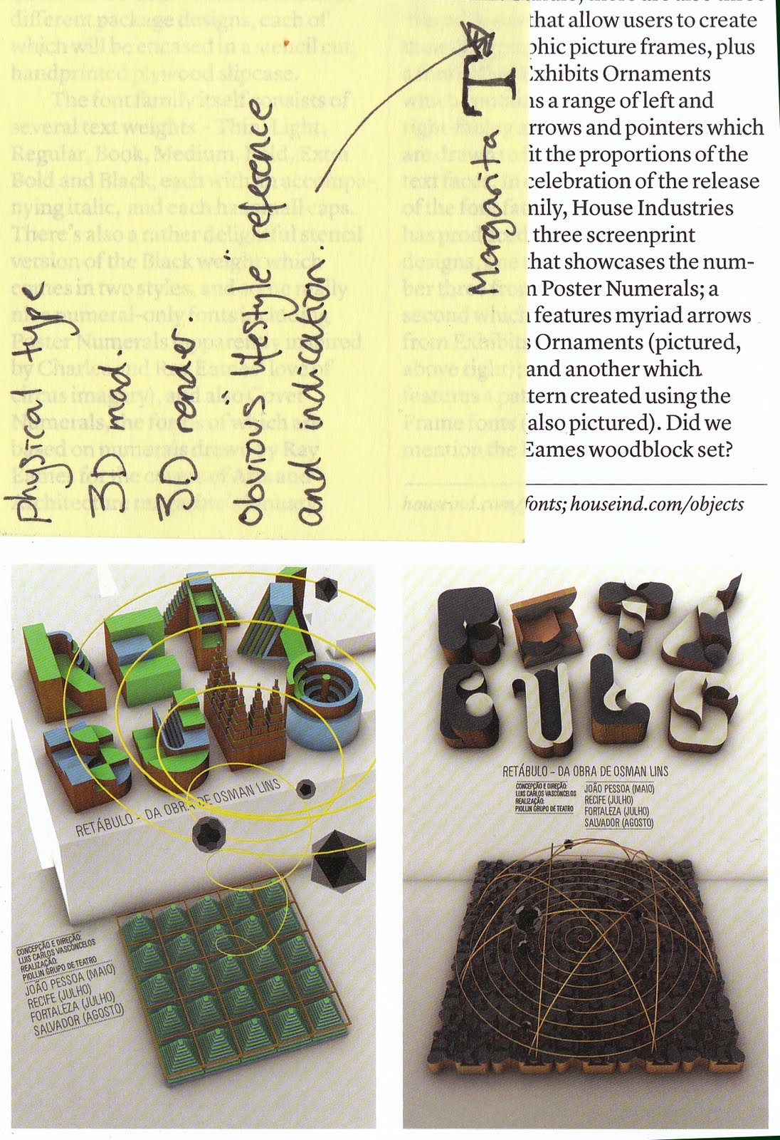
These two pieces got me thinking about the possibility of a 3D type treatment. Creating a type form in 3D and photographing it. This gives way to the chance to use a range of production methods outside of CAD. However this is not necessarily what I am 'interested' in. As in it won't be progressing my directed design practice. Fun though...

It would be very interesting to see how precise I could make the letter forms using a range of different materials. Another project perhaps.