Tuesday 26 October 2010

Woodstock Special Publication


Soko Magazineh


I have pulled out a few spreads that convey the ideas of space, time and freedom. I especially enjoy the use of minimal amounts of type to convey the appropriate message and working with the image to create something wholesomely aesthetic.


Simpsons Hotel Publication


The Lighthouse Promotion and Guide


Candy Cranks


Print/Hand/Vector Type


What For It


Annoyingly I am unable to re-find the source of this work at the moment. It is a good little example of some simple layout nicely bound. A simple design piece, not insistent upon itself, just getting the job done well.

Francis May Identity


Fly Wheel Design


Dead eye Dicks


Yes yes a lot of you have seen this, it is doing the rounds. But never-the-less should not be ignored.

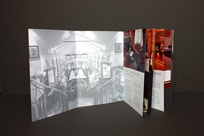
This work is admirable because of its honesty to the client. The designer has really made this bespoke to the clients.

The type is well considered, it has a human element as well as having solidity and a professional look with the bold & slab serif typefaces.